~/pito salas
home blog link blog pages + new post
admin

Posts tagged #design

124 posts

  • 2026-09-08

    The Throw Keyword was a Mistake - By Chris Fox

    Originally Posted on: https://hackernoon.com/the-throw-keyword-was-a-mistake-l9e532di

    I came across this provocative piece arguing that the throw keyword was a mistake in language design, and while I don't fully agree with the conclusion, it raises some genuinely worthwhile caveats about exception handling that are worth sitting with. It immediately reminded me of Dijkstra's classic "Go To Statement Considered Harmful" — that same energy of challenging an accepted construct that most developers never think twice about.

  • 2026-05-31

    eSUN ABS+ Filaments

    Discover eSUN ABS+ filaments.

  • 2026-05-31

    BumpMesh by CNC Kitchen

    Add displacement textures to STL, OBJ, and 3MF models directly in your browser. Preview, mask, bake, and export printable textured meshes locally.

  • 2026-05-31

    Gridfinity Rebuilt - Model Generator | Perplexing Labs

    Parametric gridfinity generator. Generate custom gridfinity bins and baseplates, openGrid components, multiboard, and honeycomb storage wall then download the STL or place an order to purchase.

  • 2026-05-31

    Tooltrace

    Custom foam cutouts for your tools

  • 2026-03-01

    12 At-Home Libraries to Inspire Any Bibliophile

    From cozy to towering, at-home libraries come in all forms. Get inspired with homes across the country.

  • 2026-02-11

    Building the Panama Canal

  • 2025-09-04

    Tufte CSS

    Magic css library to make your stuff look as good as Tufte

  • 2025-08-22

    Everything I know about good system design

    I see a lot of bad system design advice. One classic is the LinkedIn-optimized “bet you never heard of queues” style of post, presumably aimed at people who are…

  • 2024-06-25

    ✂Templatemaker

  • 2024-04-12

    GitHub - IDiAL-IMSL/Edurob: Educational robot with support for various drive kinematics

    Educational robot with support for various drive kinematics - IDiAL-IMSL/Edurob

  • 2024-03-05

    Clean Up Your Mess - A Guide to Visual Design for Everyone

  • 2024-03-04

    Write code top-down

  • 2023-12-20

    Software Design by Example

  • 2023-09-30

    Wedding Watches: The 10 Best Brands According to Our Instagram Fans

    Wedding Watches: The 10 Best Brands According to Our Instagram Fans –Weddings are an occasion for gift giving, and a fine watch always makes an ideal gift, whether it’s from a parent to a prospective son- or daughter-in-law, a groom to a best man, or exchanged between the betrothed couple in addition to (or in place of) the traditional rings. What are the best wedding watches? We put th

  • 2023-09-08

    Home

    Simple.css is a classless CSS template that allows you to make a good looking website really quickly. - kevquirk/simple.css

  • 2023-04-17

    Farnsworth House – Wikipedia

    Farnsworth House – Wikipedia –

  • 2023-03-19

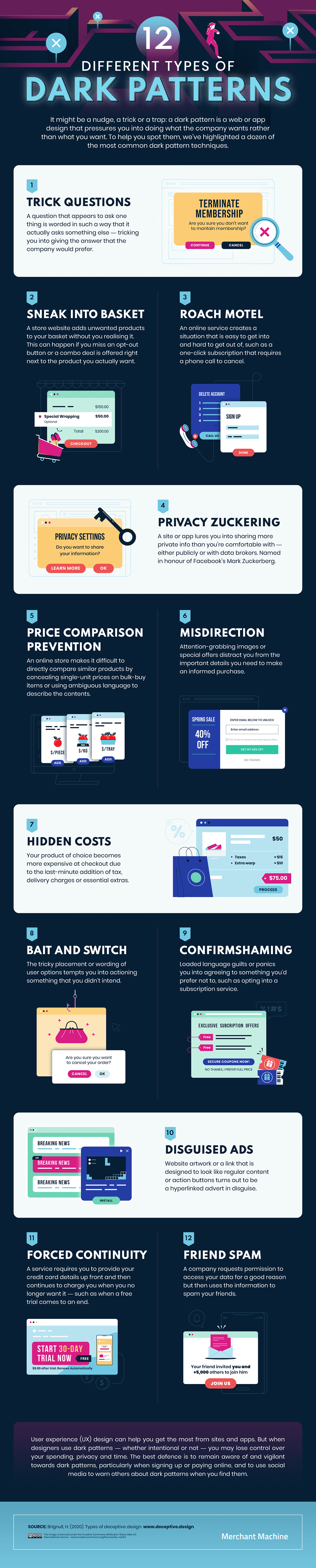
    A nice list of so-called “dark patterns”, user interface techniques to manipulate or deceive the user into choosing a course of action which is disadvantageous to the user themselves.

    A nice list of so-called “dark patterns”, user interface techniques to manipulate or deceive the user into choosing a course of action which is disadvantageous to the user themselves. –

  • 2023-03-15

    How to draw towns and cities for fantasy maps | The Kid Should See This

    Non technical, but i love sketching and drawing to pass the time. Author says: “Practice drawing little houses and towers. Then level them up with dimensional views and clusters that create different styles of towns and cities…”

  • 2023-03-14

    Ethical alternatives to revenue-generating deceptive patterns

    Ethical alternatives to revenue-generating deceptive patterns –Interesting alternatives to so-called “dark patterns”. Author says: “Avoiding deception and building trust: the power of ethical revenue generation with transparent patterns.”

  • 2023-02-07

    Visual design rules you can safely follow every time

    I love rules of thumb. Here are a set of them for graphic or visual design. I am not a designer but I fancy myself being to tell better design from worse. Anyway, this is a good tool for those of us who are wannabee designers

  • 2023-02-07

    Visual design rules you can safely follow every time

    Visual design rules you can safely follow every time –I love rules of thumb. Here are a set of them for graphic or visual design. I am not a designer but I fancy myself being to tell better design from worse. Anyway, this is a good tool for those of us who are wannabee designers

  • 2022-12-14

    The Case for Models | Concerning Quality

    An interesting idea, model based testing. The aurhor says: “Again, I’m writing about models because I have a deep desire to keep software minimal. While I don’t think it’s wrong to simply buckle up and deal with the complexity and raw magnitude of implementations as many of us do, that’s just not the path that I find appealing intuitively.”

  • 2022-11-27

    palette.fm

    A new AI colorizer. Colorize anything from old black and white photos 📸, style your artworks 🎨, or give modern images a fresh look 🌶. It's as simple as instagram, free, and no sign-up required!

  • 2022-11-19

    Tree views in CSS

    This is really useful! Its amazing what you csn create and do with CSS - “How to create a tree view (collapsible list) using only HTML and CSS.”

  • 2022-08-28

    CodeSee – Bring visibility to your codebase

    CodeSee is the world’s first solution for Continuous Code Understanding. CodeSee helps development teams visually understand how your large-scale codebase works, document it, and collaborate continuously.

  • 2022-07-17

    37 Easy Ways to Spice Up Your UI Designs

    37 Easy Ways to Spice Up Your UI Designs –Simple and actionable: “Illustrated tips for making your UI and web designs more visually interesting · Backgrounds · Borders & dividers · Shadows · Text · Other techniques”

  • 2022-06-10

    highlight.js demo

  • 2022-04-24

    Red Circle Postmark Logo | DesignEvo Logo Maker

    DesignEvo s logo maker helps you create custom logos in minutes for free, no design experience needed Try with millions of icons and 100 fonts immediately!

  • 2022-04-24

    Red Circle Postmark Logo | DesignEvo Logo Maker

    Red Circle Postmark Logo | DesignEvo Logo Maker DesignEvo s logo maker helps you create custom logos in minutes for free, no design experience needed Try with millions of icons and 100 fonts immediately! April 24, 2022 at 03:25PM

  • 2022-04-24

    Top 10 T-shirt Design Tips

    Top 10 T-shirt Design Tips Our senior designer gives you his all-time top 10 T-shirt design tips, along with examples and pro tips, to help improve any custom print. April 24, 2022 at 04:03PM

  • 2022-03-20

    Artvee

    Artvee Browse and download high-resolution, public domain Paintings, Drawings, Illustrations and Posters. March 20, 2022 at 02:22PM

  • 2022-03-09

    Randall Degges - Heroku and SOA

    Heroku's platform was designed with services in mind. If you're building a service oriented web app, you might find this interesting.

  • 2022-01-02

    Home | Old Book Illustrations

    Home | Old Book Illustrations Old Book Illustrations offers a wide range of public domain, royalty-free images scanned from old books. Searchable galleries include animals, plants, techniques, artists names, books titles, and much more… January 2, 2022 at 02:16PM

  • 2021-12-16

    CardBoard Basics: Full Series with Advanced Basics plus Tools

    CardBoard Basics: Full Series with Advanced Basics plus Tools All three cardboard videos in One, adjusted sound, new footage and all new footage and voice over and music for the tools section. CardBoard Basics, a Tutorial guide for Chip Board matte board, Bristolboard and model making for all designers architects model makers hobbyists and crafters.I show how I build some 2″ x 2″ 50.8mm x50.8mm cardboard cubes as well as some more advanced shapes using straight cut x-acto blades and white PVA glue.

    X-Acto #11 extra durable 100 Pack Blades https://amzn.to/349F2Fu

    Xacto Black Gripster: https://amzn.to/2JuxOCx

    Elmers 16oz white glue h...

    Read more →
  • 2021-11-22

    Remove Background From Images For Free – Erase.bg

    Remove Background From Images For Free – Erase.bg Remove background from images of humans, animals or objects and download high-resolution images for free. You can also edit and resize images as you like. November 22, 2021 at 08:40PM

  • 2021-10-31

    Free Interactive 3D Model for Drawing Figures, Dynamic Poses, and More - Online Drawing Mannequin

    As an artist, you probably have drawn the human body several times and realized how difficult it is to do it all from memory. This is where an adjustable online drawing model comes in handy. These adjustable models are also often called drawing mannequins

  • 2021-10-31

    Free Interactive 3D Model for Drawing Figures, Dynamic Poses, and More – Online Drawing Mannequin

    Free Interactive 3D Model for Drawing Figures, Dynamic Poses, and More – Online Drawing Mannequin As an artist, you probably have drawn the human body several times and realized how difficult it is to do it all from memory. This is where an adjustable online drawing model comes in handy. These adjustable models are also often called drawing mannequins October 31, 2021 at 02:21PM

  • 2021-09-08

    DiceBear Avatars

    DiceBear Avatars

    September 8, 2021 at 03:38PM

  • 2021-08-22

    Blush: Illustrations for everyone

    Blush: Illustrations for everyone Blush makes it easy to add free illustrations to your designs. Play with fully customizable graphics made by artists across the globe. August 22, 2021 at 08:48PM

  • 2021-08-22

    Search with 1 image on Same Energy

    Search with 1 image on Same Energy Same Energy is a search engine for finding beautiful images. August 22, 2021 at 08:54PM

  • 2021-08-22

    Flim

    Flim 💡 The perfect tool for inspiration! August 22, 2021 at 08:55PM

  • 2021-08-22

    JumpStory

    JumpStory Handy collection of images to use in development and writing August 22, 2021 at 08:45PM

  • 2021-07-11

    Movie Posters Collection - Harry Ransom Center Digital Collections

    Massive collection of images of old movie posters

  • 2021-04-06

    Custom Stencils from Wall to Wall Stencils

    Custom stencils of phrases, quotes, scriptures, and lettering for stenciling in your home

  • 2021-04-06

    Many Eyes

  • 2021-04-06

    CSS Reference

    SitePoint.com - With a vast variety of web design tutorials and articles coupled with a vibrant and well informed community, SitePoint the natural place to go to grow your online business

  • 2021-04-06

    99designs | Logo Design, Web Design and More. Design Done Differently.

    The global creative platform for custom graphic design: logos, websites and more. Hire a talented designer or start a design contest. 500k+ happy customers have used 99designs to grow their business.

  • 2021-04-06

    99designs | Logo Design, Web Design and More. Design Done Differently.

    The global creative platform for custom graphic design: logos, websites and more. Hire a talented designer or start a design contest. 500k+ happy customers have used 99designs to grow their business.

  • 2021-04-06

    Icon Reference Chart | The Icon Handbook

    The Icon Handbook is a reference manual, how-to guide and coffee table 'showcase' in one. learn how to design icons for interfaces

  • 2021-04-06

    NounProject

    Noun Project features the most diverse collection of icons and stock photos ever. Download SVG and PNG. Browse over 3 million art-quality icons and photos.

  • 2021-04-06

    Social Design - Facebook Developers

    Facebook social design

  • 2021-04-06

    Free Web & Mobile Mockup and UI Prototyping Tool

    Turn individual screen mockups into a flow. Very simple. Free.

  • 2021-04-06

    Popular UIs | Free PSDs of popular Web Interfaces

    PSDs of UIs. Good way to learn how to do a design in PSD.

  • 2021-04-06

    Designer Stationery, Personalized Stationery, Stationery Invitations

    Thank you cards etc

  • 2021-04-06

    Bauhaus. A Conceptual Model | Catalogue

    This website is for sale! modell-bauhaus.de is your first and best source for all of the information you’re looking for. From general topics to more of what you would expect to find here, modell-bauhaus.de has it all. We hope you find what you are searching for!

  • 2021-04-06

    What RESTful actually means

  • 2021-04-06

    Animations - CSS Reference

    Learn how Animations works in CSS.

  • 2021-04-06

    Box2D tutorials - Introduction - iforce2d

  • 2021-04-06

    Steering Behaviors For Autonomous Characters

  • 2021-04-06

    ems2 - Mockingbird

  • 2021-04-06

    flot - Project Hosting on Google Code

  • 2021-04-06

    Google Chart Tools - Google Code

  • 2021-04-06

    Prettify* — Nice icons and wallpapers

  • 2021-04-06

    Bauhaus: Workshops for Modernity - Home

  • 2021-04-06

    Bauhaus Manifesto

    Small business web hosting offering additional business services such as: domain name registrations, email accounts, web services, FrontPage help, online community resources and various small business solutions.

  • 2021-04-06

    Color Scheme Designer 3

    In love with colors, since 2002. A designer tool for creating color combinations that work together well. Formerly known as Color Scheme Designer. Use the color wheel to create great color palettes.

  • 2021-04-06

    Website Usability Testing Service - Feedback Army

  • 2021-04-06

    Balsamiq

    Balsamiq is the company behind Balsamiq Wireframes, the industry standard low-fidelity wireframing tool.

  • 2021-04-06

    UI-Patterns.com

    User Interface Design Pattern Library. UI patterns for web designers. See screenshot examples and learn how to do great design like the pros.

  • 2021-04-06

    Artificial Intelligence (AI) for Computer Games - Home

    Companion site for the book Artificial Intelligence for Computer Games: An Introduction. Includes bibliography, errata, chapter guide, and relevant links.

  • 2021-04-06

    ai-junkie

  • 2021-04-06

    Amit’s Game Programming Information

  • 2021-04-06

    CSS Positioning Simplified – Jacob Greenaway – Medium

    You can never have this explained often enough

  • 2021-04-06

    Difference between .sass and .scss | Responsive Web Design

    SASS and SCSS are practically the same thing, but this article explains the difference in a little more detail

  • 2021-04-06

    Design Review: Key-Value Storage

    Don’t know why we need a new one exactly but a good effort

  • 2021-04-06

    CSS doesn’t suck - Andy Bell

    See previous post. I admit I haven’t built super complicated sites, but I always seem to avoid extra languages or preprocessing if at all possible.

  • 2021-04-06

    End-to-End Arguments in System Design | the morning paper

  • 2021-04-06

    The Throw Keyword was a Mistake - By Chris Fox

    I don’t think I agree. But does contain some good caveats. Reminds me of the old “Goto considered harmful”.

  • 2021-04-06

    Building Your Color Palette

    Excellent guide to picking good colors in a UI

  • 2021-04-06

    Charts.css

    From the looks of it this is a super handy library doing charts without needing JavaScript. Does it work? Don’t know yet.

  • 2020-11-23

    Some great links for 11/24/2020

    Building Your Color Palette

    Excellent guide to picking good colors in a UI

    tags: color design palette howto

    Posted from Diigo. The rest of my favorite links are here.

  • 2019-09-12

    Some great links for 09/13/2019

    Best Free Bootstrap UI Kits of All Time – DEV Community

    Always good to have more free things!

    tags: toolkit free bootstrap

    Posted from Diigo. The rest of my favorite links are here.

  • 2018-12-07

    Some great links for 12/08/2018

    Picking a colour scale for scientific graphics | Better Figures

    Picking colors is not an obvious thing. This is a good article about this!

    tags: graphics colour color palette

    Posted from Diigo. The rest of my favorite links are here.

  • 2018-05-16

    Some great links for 05/16/2018

    Weekly Command: managing processes with htop

    tags: processes command cli

    Leveraging Mental Models in UX Design

    tags: models design

    Posted from Diigo. The rest of my favorite links are here.

  • 2018-04-30

    Some great links for 04/30/2018

    Low-hanging design fruit: why you should use Google Font Superfamilies

    tags: fonts design

    CSS at Scale: LinkedIn’s New Open Source Projects Take on Stylesheet Performance

    t...

    Read more →
  • 2018-04-22

    Some great links for 04/22/2018

    How to improve your workflow with VS Code and Jupyter Notebook

    tags: jupyter vscode

    7 Rules for Creating Gorgeous UI (Part 1) – Erik D. Kennedy – Medium

    Great actionable tips

    tags: UX user interface ...

    Read more →
  • 2018-04-20

    Some great links for 04/20/2018

    7 Practical Tips for Cheating at Design – Refactoring UI – Medium

    Awesome useful tips for pretty design!

    tags: css aesthetics design

    Why CSS Grid is better than Bootstrap for creating layouts

    tags: css grid ...

    Read more →
  • 2014-02-26

    Jonathan Harris on being stuck

    Jonathan Harris is the creator of several really interesting web sites that in very creative ways combine art with computing. From his home page one might conclude that he’s a bit

    “This is the website of Jonathan Harris. I make projects that explore the relationship between humans and technology, incorporating computer science, statistics, storytelling, visual art, and other techniques. I see our species evolving into a single meta-organism, brought to life by the Internet, even as we live our individual lives, searching for meaning and beauty. My projects straddle these scales of existence—from the planetary to the personal. I make ...

    Read more →
  • 2013-12-30

    Design Thinking vs. Lean Startup

    Point Solving Problems for Real World, Using Design – NYTimes.com:

    While the projects had wildly different end products, they both had a similar starting point: focusing on how to ease people’s lives. And that is a central lesson at the school, which is pushing students to rethink the boundaries for many industries.

    A fascinating article about the “Plattner Institute of Design at Stanford” also known as the D.School.

    Everyone knows that Design Thinking is great and the new hotness. I love great design, and am in awe ...

    Read more →
  • 2013-05-22

    Useful document about design for iOS (iPad and IPhone)

    Starters Guide to iOS Design:

    As someone who does work on both the development and design side of iOS apps I find that many designers struggle with the transition to UI work, or with the different processes involved in iPhone and iPad app design. In this guide I’ll describe the deliverables you’ll be expected to produce, outline the constraints of the medium and introduce fundamental iOS and UI design concepts.

  • 2013-02-11

    Did someone actually have to invent that?

    NewImage

    A really charming article about John Karlin who was one of the first UX guys. He worked at Bell Labs back in the day and helped determine lots of little details about how telephones are designed. Simple silly things like that putting a dot (to “aim” at) visible through each finger hole of a dial phone improved accuracy and speed of dialing.

    He determined, through testing, the best shape (square) and arrangement (a rectangular grid) and ordering (1-2-3 in the top row) of ...

    Read more →
  • 2012-11-11

    These icons are too similar to be coincidences

    One of these two is from Apple and one is from Google. They both contain coupons and cards. Which is which?

    Screen Shot 2012 11 11 at 12 17 05 PM Screen Shot 2012 11 11 at 12 19 54 PM

  • 2012-11-03

    Intellectual Property? Copyright? Or just a lot of LOVE?

    I was rather proud of the art I designed for a t-shirt this summer. It’s cool but of course it’s a direct ripoff, um, no, I mean, it was inspired by a well known piece. If I show you my design, below:

    JBSlogoonly

    You will immediately see the resemblance. You might say, oh that was on a postage stamp:

    220px Lovestamp

    Or you might say, oh, that was a New York City thing. But you would be remembering wrong:

    ...

    Read more →
  • 2012-09-22

    A list of UI and UX books, articles and links

    I created this quick and dirty list of useful resources for some friends who wanted to dig into the latest thinking on web and mobile user interface design. I am sure this list is incomplete and quirky but I thought it would be good to share:

    I’ve had great luck with Lynda.com courses. It’s only $25 per month, and you can watch as many as you like. Here’s one about CSSS for Developers Here’s another to teach you Photoshop. I’ve actually taken a lot of this one. The author is great. A famous book with basic concepts on ...

    Read more →
  • 2012-07-11

    T-Shirt Design

    Code T-Shirt, © Pito Salas, 2012. Let me know if you want to order one!

    Screen Shot 2012 07 10 at 8 48 00 PM

  • 2012-03-13

    Why doing design for Facebook is a thankless job

    A friend of mine hates, HATES, the new Facebook timeline. She wants to turn it off, but can’t. I happen to think the timeline is really cool, well designed, useful. On occasion it even gives me goosebumps. But. She. Hates. It. Wants to turn it off. Can’t.

    I was thinking, Facebook has something like 700,000,000 users, right? I don’t know the right number or how many are online every day. But there are many.

    So imagine you are responsible for the design of this important new Facebook feature called the TimeLine. You need to invent the look and feel of the new Facebook Timeline. You design your little heart out. You have user tests, A/B/C/D/E tests. Hundreds of people and thousands of dollars later you release your baby.

    95% of the users love it. Success right?

    35 million people still hate the design.

    Bummer.

  • 2012-02-24

    What is Pinterest good for?

    Funny thing, I like many people are trying to figure out what Pinterest is good for. Well I found a use.

    From yesterday’s post, you saw that I am searching for a new application icon for BlogBridge. In fact I listed a series of out/crowdsource design options. What I need to do now is to provide them with design guidance, a design brief.

    So as you may imagine, I’ve been looking around the web for icons and logos which I like because one of the best ways to tell a designer what you are looking for is to show them the stuff you like.

    See where this is going?

    Voila, what better use for Pinterest can you think of?

    Here’s my Pinterest “BlogBridge Icon Inspiration” Board

    I will try to set it up so you can add an idea or two if you have any contribution. Whoops, that might be dangerous. Shall we try?

  • 2012-02-23

    Crowdsourcing a new BlogBridge icon

    Well, it’s been about 5 years with the same (lovely) BlogBridge application icon and as we are redesigning the web site and releasing a major new release of the product, we thought, hey, it’s time to update the icon to something, ahem, a little more modern.

    In case you forgot (or never knew),here’s what the BlogBridge app icon looks like today:

    Blogbridge

    I guess, nice, but boring, yes?

    So what I am looking for is a beautiful new, 3D rendered, and meaningful application icon. Something that will look really cool in my dock (but equally on a Windows or Linux desktop.)

    So far I’ve consid...

    Read more →
  • 2012-01-21

    Designed As Designer

    If you are interested in design and especially design and architecture of software, and you have a philosophical bent, you will enjoy this essay… I can’t even attempt to summarize it’s content, and even the abstract from the paper itself is quite inscrutable:

    “Conceptual integrity arises not (simply) from one mind or from a small number of agreeing resonant minds, but from sometimes hidden co-authors and the thing designed itself.” (From Designed As Designer)

    What can I tell you. The author is the Richard Gabriel, a luminary of the computer world. Here’s the article: Designed as Designer.

  • 2011-12-31

    Sharing Web Site Designs

    Recently I wanted to get feedback on one of several ideas for the design of the new BlogBridge web site. I had selected 6 product web sites that had a nice look and wanted to somehow visually compare them. Here are two free tools I used:

    Papparazzi! is a free Mac utility that does one thing and does it well. It makes a screen shot from a URL of a web site, importantly, including the whole page not just the part that is visible without scrolling. Pintrest is a free web site that facilitates sharing of images of things. Kind of like a delicious for images … or something. It’s kind of hard to describe whic...

    Read more →
  • 2011-12-21

    Wall Street Journal has some sensational data visualization

    I don’t know if you need an account to see the amazingly useful, elegant and well implemented bit of data visualization in the Wall Street Journal. Typical of a nerd like me, I focus more on the design and technical elements than the data that it is trying to show. The data, by the way is polling data sliced in all kinds of ways that are useful and easy to use. Well done WSJ!

    Screen Shot 2011 12 21 at 9 22 45 AM

  • 2011-08-27

    Quirky for Mobile Products?

    I read about Quirky.com in the paper the other day. From my perusal it’s a site where people (you and me) can submit ideas for manufactured products.

    For example, let’s say I have an idea for a dog leash with a built in flashlight. Clever eh? Well, you can describe it to the best of your ability and submit it to the Quirky.com site.

    Ideas are socially curated (translation: visitors to the site can vote on how much they like the product.) Once they reach a certain threshold then the Quirky staff analyzes the idea from a design, marketing, manufacturing perspective, ...

    Read more →
  • 2011-03-19

    Case Study of User Experience Design and Lean Methodology

    A good read if you are interested in fast iteration in user experience design and redesign:

    “By the end of the iterations and tests, every single one of the users liked the new version better than the old, and we had a very good idea why.” (from Case Study: UX Design and Food on The Table)

  • 2010-10-28

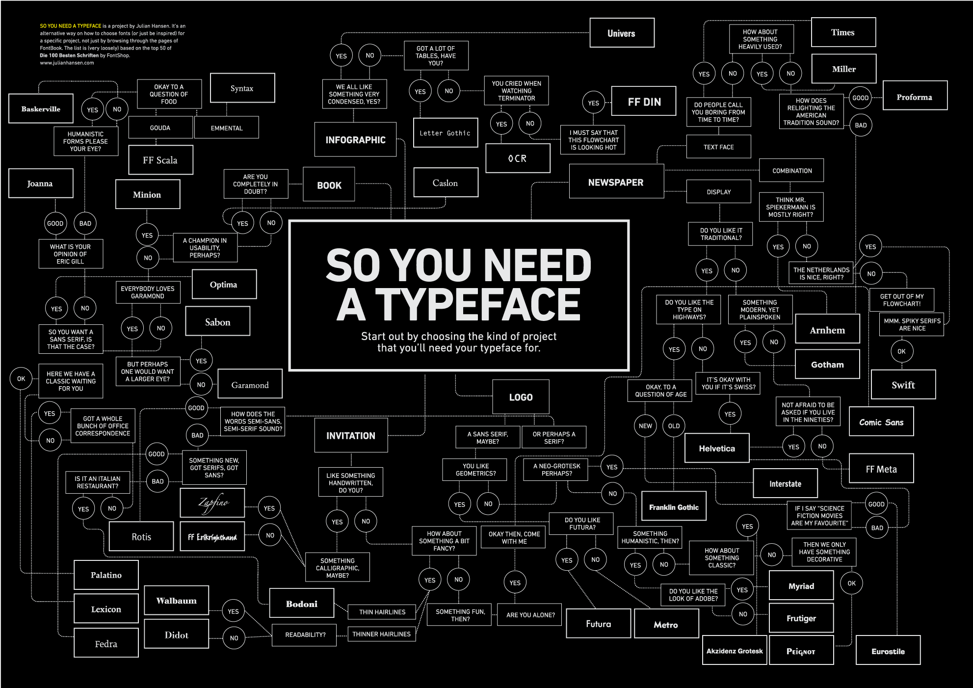
    [DESIGN] Typography Cheat Sheet

    If you are into fonts and typography, you might enjoy this Infographic that will help you choose.

  • 2010-09-18

    How (not) to design a ballot

    My head is full of democracy and elections these days. How come, you ask? Well for the last year or so I’ve been working for the Open Source Digital Voting Foundation, on elections technology. This month’s focus is generating ballots for two elections happening in November. So more than usual, I am dreaming in black and white forms. Anyway… I came across a couple of instructive blog posts about the new non-lever voting that New York unveiled this month. Predictably, when dealing with humans, some people don’t like them. You can’t please them all, right? But really the objections raised here are quite legitimate.

    If this important yet rather esoteric topic interests you, here are three good ...

    Read more →
  • 2010-08-15

    Fun article about faux-physical UI metaphors

    Ok, that’s my own curious headline for this interesting article in the New York Times: “What, after all, is a more recognizable symbol of the capriciousness of life than a deck of cards, out of which your fate is randomly dealt? And yet here the deck icon is only superficial. At heart it’s not a random-card generator but the opposite: a highly wrought program with a memory, an algorithm and a mandate to keep children in the game. An app posing as a spatiotemporal object.” (from The New York Times)

  • 2009-12-13

    A good scratchboard/clayboard tutorial

    In my graphic design work I’ve gotten to know scratchboard (aka clayboard.) It’s a very cool material that I’ve had a lot of success with. Here’s an early example. Here’s a pretty good rundown of many of the tools, materials and techniques for working with clayboard. I found it very informative.

  • 2009-12-07

    An interesting video about design of Windows 7’s default desktop colors

    If you’re interested in design and illustration, you might like this video of how Microsoft went about designing the default desktop for Windows 7. Also some interesting commentary about the challenge of designing an Operating System for an astronomical number of different PC configurations.

  • 2008-12-14

    How are the New England Patriots like the United States Post Office?

    I’ve gotten more interested in logos and graphic design lately so I guess I am noticing stuff like this more than before…

  • 2008-11-16

    Do you like this building?

    I came across this ad in the New York Times magazine. I should say, I was riveted by this ad. Is this a real building? Is it built yet? You have to take a look at some of the images on (what I think is) their main site. But really the ad in the magazine is the one that is still the most impressive.

    Which leaves me with the question, is this thing a good idea? I wonder?

    Just quickly looking around some of the stuff I read online about it leaves me with the question of whether this is an architectural/engineering/construction tour the force which in the end will not much improve the world.

  • 2008-07-13

    Fun little web goodies

    Check out “Forget Photoshop: 15 Online Graphics Generators“: “Shiny edges, reflections, neat 3D effects – you love them and can’t get enough of them. Well, there’s no reason to spend any time in Photoshop creating them since there are so many tools out there that will do the dirty work for you. Without further ado, here’s a roundup of 15 online Web 2.0 graphics generators.” (from “Forget Photoshop: 15 Online Graphics Generators“)

    ...

    Read more →
  • 2007-06-05

    “Icons: What are they good for?” — “Absolutely Nothing!”

    Jeremy Wagstaff, in his regular “Loose Wires” column tells some truth about icons in software: “One day, probably quite soon, people are going to look at the little icon in their software program that denotes “save” and say, “What the heck is that supposed to be?” That’s because, in most cases, the icon in question is a floppy disk — one of those plastic-enclosed disks some of us still use to store and transport data. And, of course, one day there will be computer users who have no idea what a floppy disk is.” (from “...

    Read more →
  • 2007-03-14

    Daylife’s Universe: Eye Candy or Brain Food?

    Daylife is a new news oriented web site that came onto the scene a little while back to a lot of fanfare. I’ve used it on and off and it’s ok. It’s certainly a lot prettier to look at than things like Google News. Daylife’s emphasis on design and the use of photography both are quite striking and make the site worthwhile. Today they are introducing another wonderful bit, via Daylife Labs (does everyone have to have a ‘labs’ now?) It’s called Daylife Universe.

    What is it? I can’t quite explain it. It’s a super mega visualization of all the news that is happening or is...

    Read more →
  • 2006-08-30

    Interesting article with a catchy title: “Surprising Truth about Ugly Websites”

    Someone forwarded this to me the other day. You might have seen it, but I still thought it was worth mentioning, because I had not come across it before. In fact I didn’t even know about the site where the article was published, SiteReference.

    Here are a couple of brief excerpts:

    “That’s right – ugly websites are surprisingly effective in making money. As a person who puts business before technology, a profitable website is a website is an unbelievably attractive website to me.” (from ...

    Read more →
  • 2006-07-09

    A beautiful visualization of news across the world

    I came across this the other week and made a note of it.It really shows off all the cool stuff that can be done with Flash. Yeah Ajax gets all the attention lately, but in many ways Flash is cooler.

    [Check it out!

    ](http://www.jeroenwijering.com/whatsup/)

    Technorati Tags: ajax, flash

  • 2006-06-07

    links for 2006-06-07

    Creating Passionate Users: What a graphic can tell you

    What your life looks like as a bunch of dots. Interesting visualization.

    (tags: Visualization Design information soflow)

    Agile Work Artifacts – the Work Item List (Agile Advice)

    Interesting summary of the work list or backlog in Agile methodologies.

    (tags: scrum agile backlog)

  • 2006-04-19

    Fun movie and TV fonts

    This just proves that you can get just about anything on the web. Here’s a site that provides custom font sets immitating the type face used in a whole bunch of TV Shows and Movies. Amusing.

    Technorati Tags: funny

  • 2006-03-22

    If you love words you’ll love this

    All the words of the english language, ordered by frequency, coupled with some really nifty graphic design and ajaxian coding. Enjoy!

    This is the work of Jonathan Harris. Here are some of his other projects. Quite cool!

    Correction: In fact as several readers have said, this site is not Ajax, it’s Flash! Which again proves why everyone’s obsession with Ajax is almost as bad as their our obsession with Web 2.0

    Technorati Tags: ajax, graphicdesign

  • 2005-12-09

    They are all fake…

    Check out these amusing images which I came across on the Advertising/Design Goodness Blog. Yes, they are all fake, but very cool!

    Technorati Tags: advertising, attention, cool

  • 2005-12-07

    Long tail UI Widget

    Picture 8-2 This is kind of cool.

    I am playing around with the Last.FM music service.

    Among the many things it does, is that It ‘watches’ everything you play with iTunes to figure out your music tastes. And then with that, Last.FMrecommends music that you might like.

    What caught my eye is the first use of the famous ‘long tail’ graph as a User Interface element. You can drag the vertical bar right and left to affect whether the recommended music is more in the popular or obscure range of possibilities. Cute!

    Technorati Tags: cool, longtail

  • 2005-05-03

    Too much good stuff: makes me feel inadequate :-)

    I saw this in the Wall Street Journal:

    “Marcos Weskamp, a 27-year-old Web designer in Tokyo, created a graphical interface1 for Google News as a way to see how much attention is given to individual stories. A headline that has appeared in several publications is represented by a large box, while a story that is less widely covered shows up as a smaller square. The boxes are grouped by color into categories like business and entertainment.” – Wall Street Journal, subscription needed.

    What a totally cool idea, and beautifully implemented!

    Technorati Tags: cool, UI

  • 2004-09-10

    Patterns from the master

    I came across a fascinating article,a transcript of a speech by Christopher Alexander, architect and author of “A Pattern Language.” Alexander is the guy who invented Patterns as they have now been broadly adopted by the Software Design community. In this piece Alexander tells of the thinking and objectives that led to the Pattern approach to architectural design – much more than simply cataloging patterns that were known work. He was hoping that when architects used these patterns they would be led, driven, forced into creating living and livable structures.

    In his words:

    ...

    Read more →
  • 2004-07-02

    [JAVAONE] User Interface Design

    Someone whose oppinion I listen to, Karsten Lentzch, recommends these books about user interface design:

    Jeff Johnson: GUI Bloopers: Don’ts and Do’s for Designers Ellen Isaacs: Designing from both sides of the screen Mullet: Designing Visual Interfaces

    Background: I went to a couple of presentations by Karsten Lentzch at Jav...

    Read more →

© Salas Blog. All rights reserved.